Photographer: Lumi Heikkilä
MISU
The beginning of Tetzu
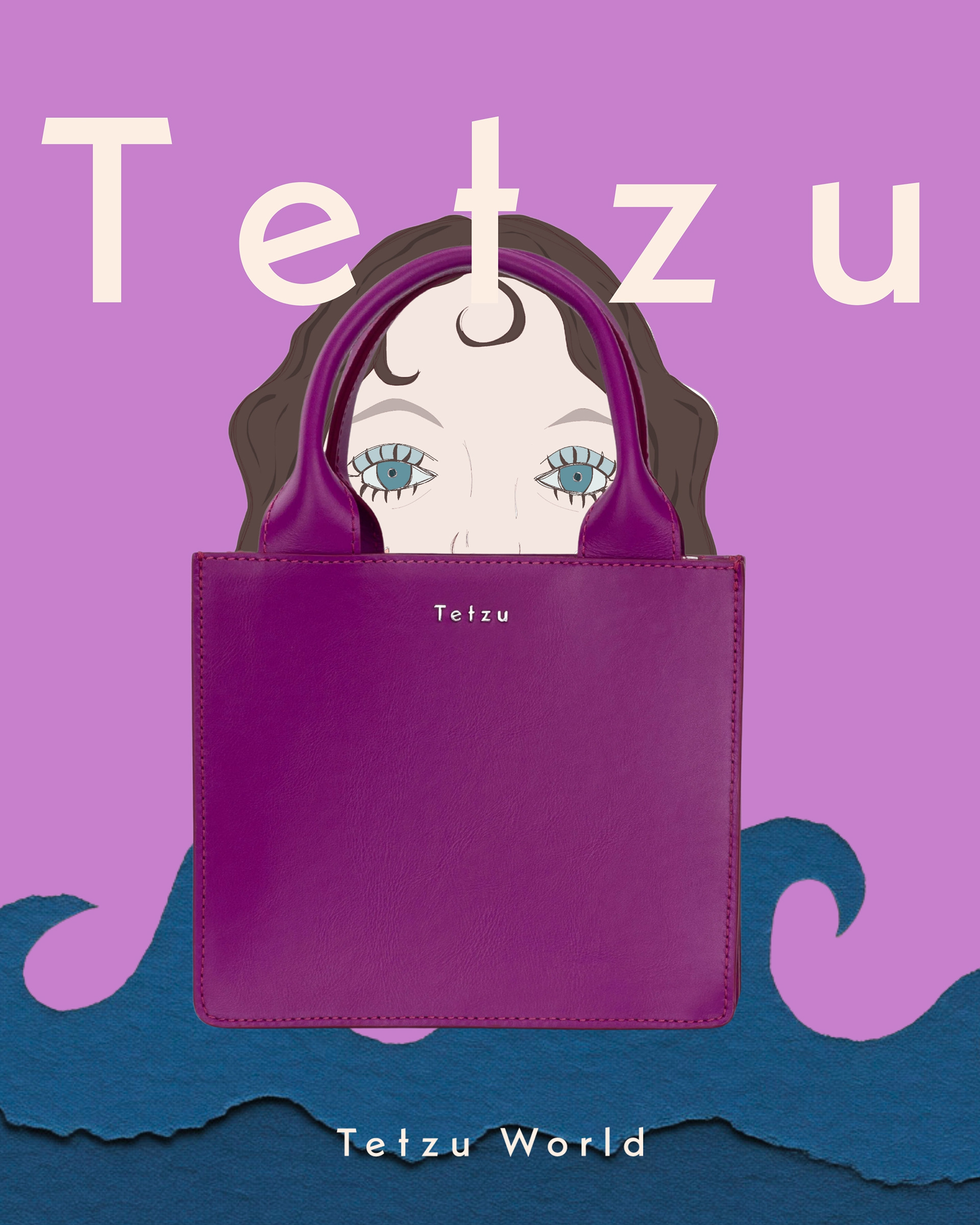
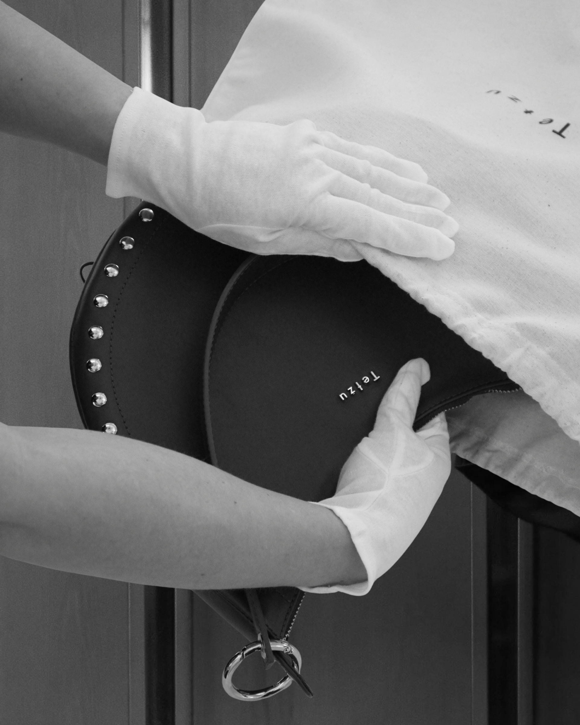
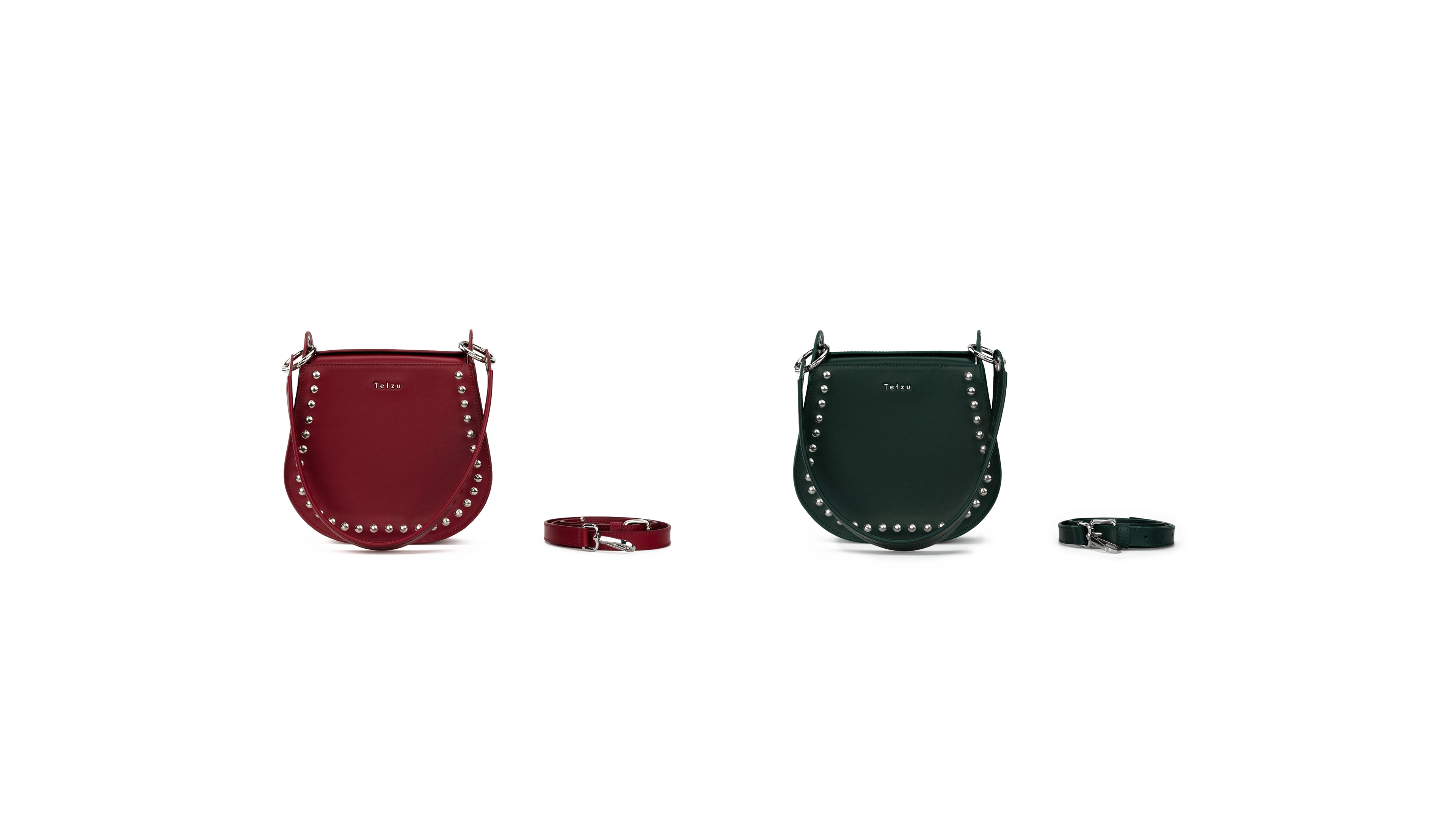
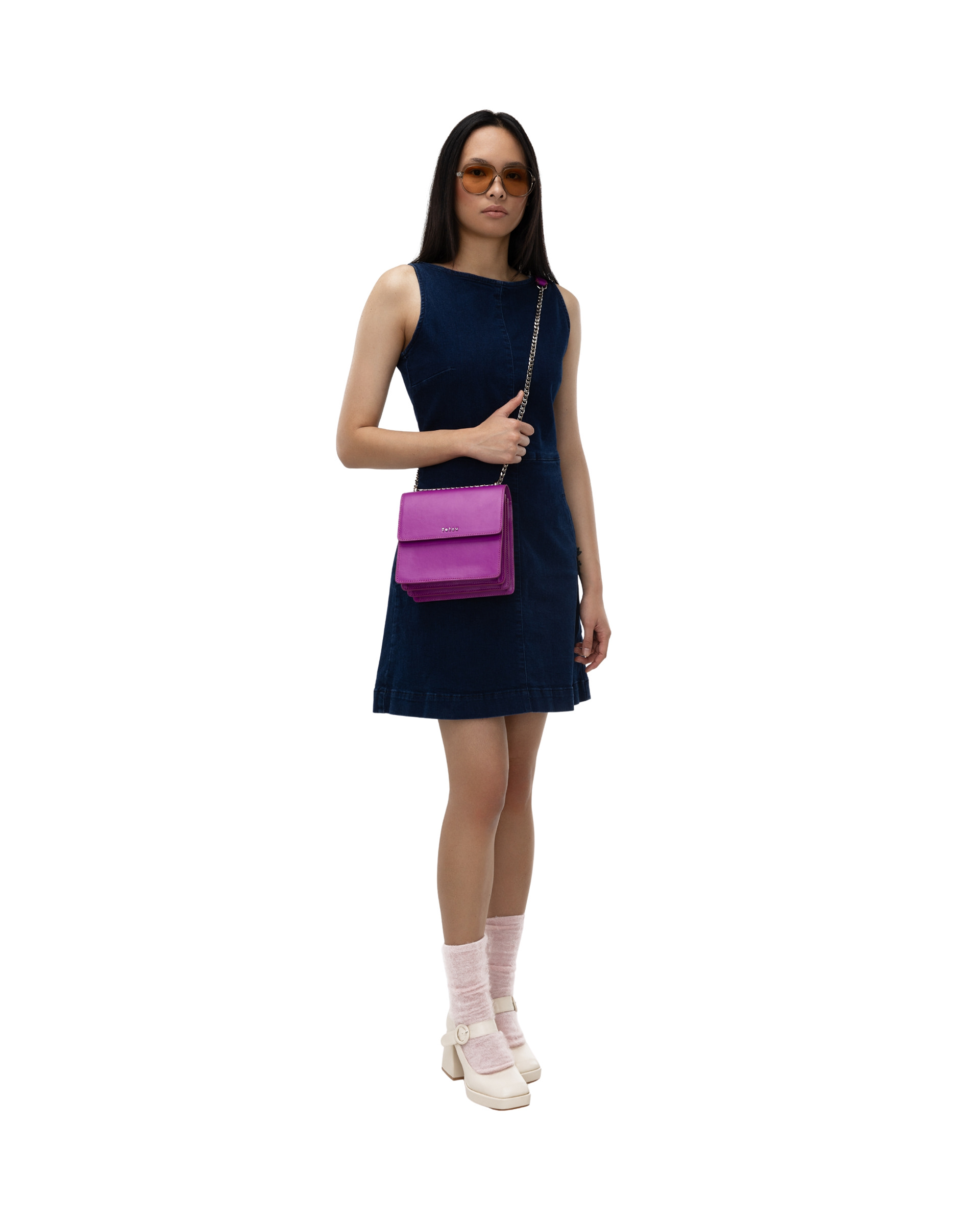
Misu was the first bag I designed for Tetzu and became the starting point for the brand's product identity.
Its rounded silhouette was inspired by a vintage leather handbag I discovered in my great-grandmother's wardrobe as a child. I wanted to transform that personal memory into a contemporary object with a distinctive yet timeless character.
Founded & designed by: Katariina Rainio
Based in: Finland
Focus: Accessories / Product Design / Materials
Based in: Finland
Focus: Accessories / Product Design / Materials
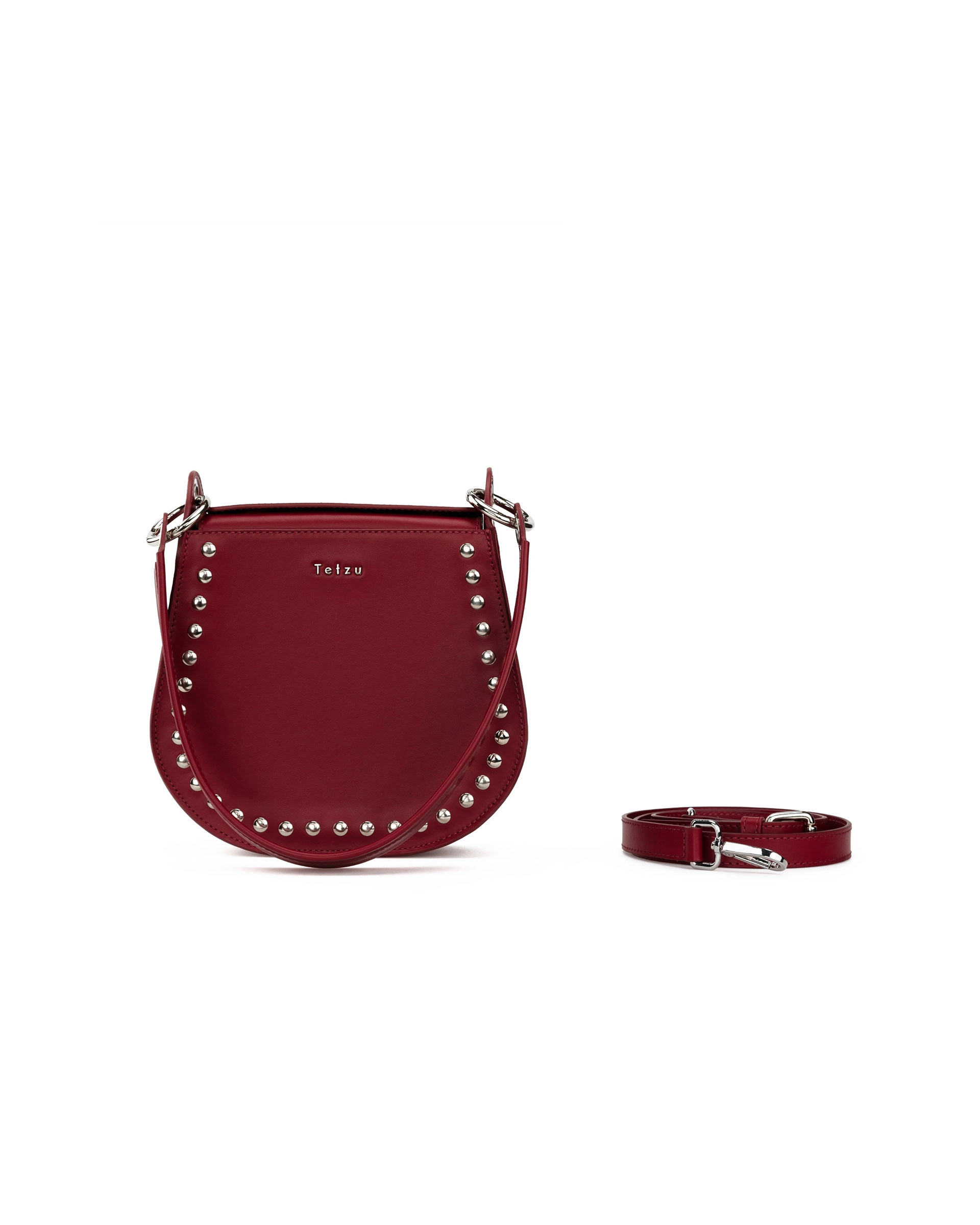
Photographer: Lumi Heikkilä
Product Design
I wanted to create leather bags with a strong and recognisable character while remaining timeless and functional.
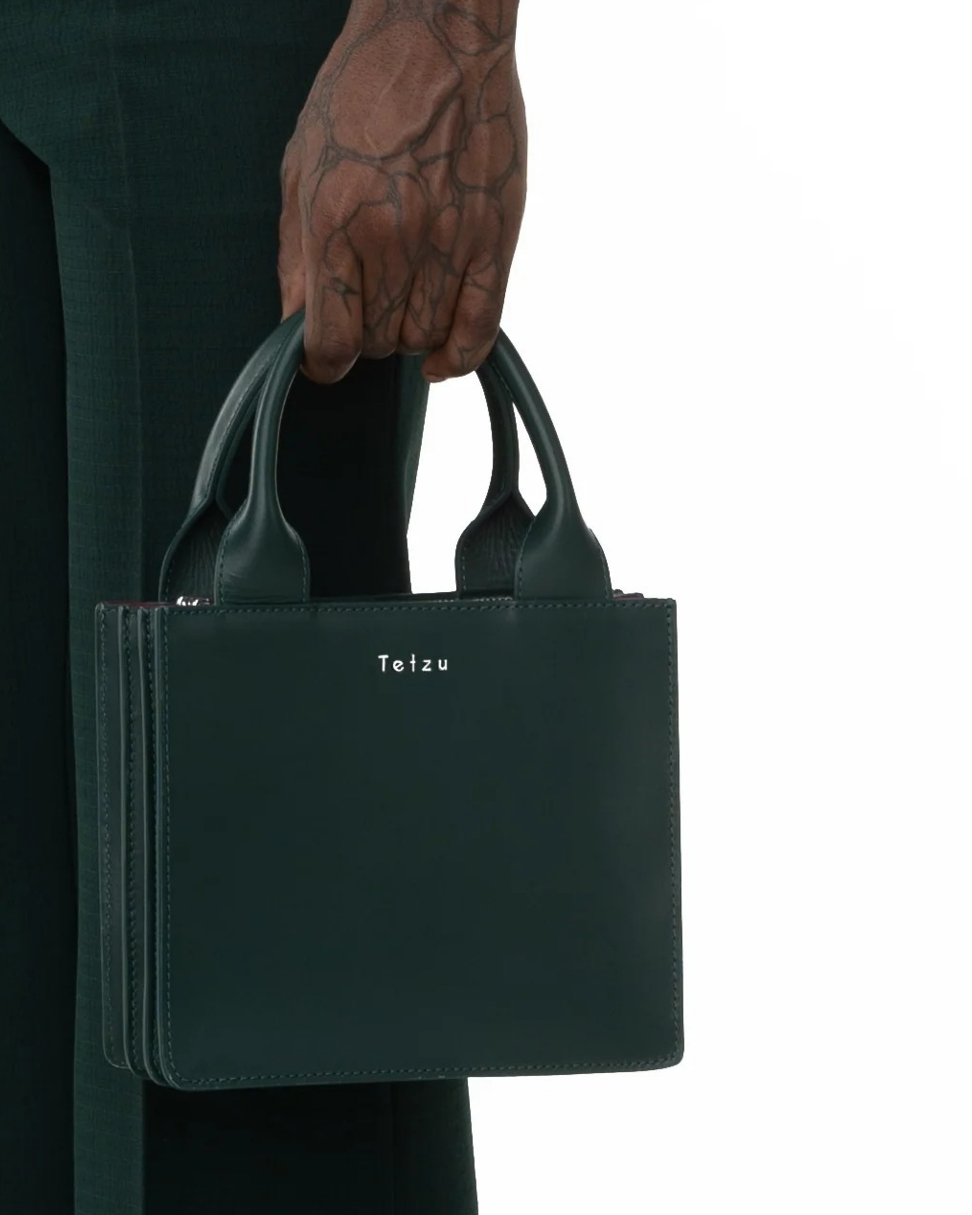
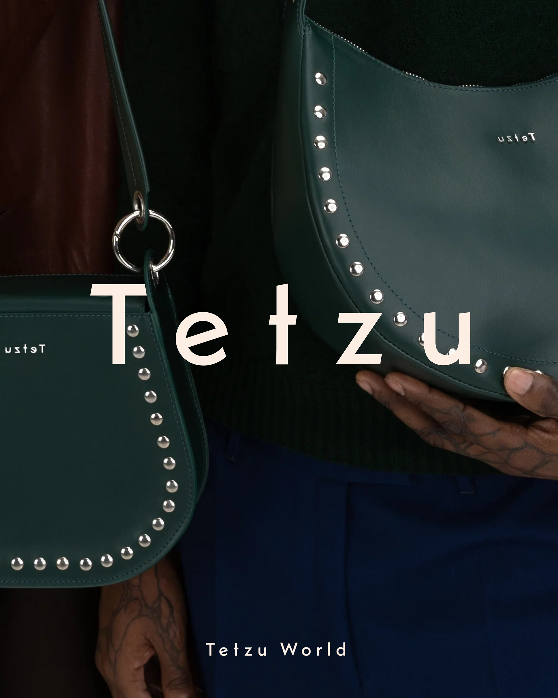
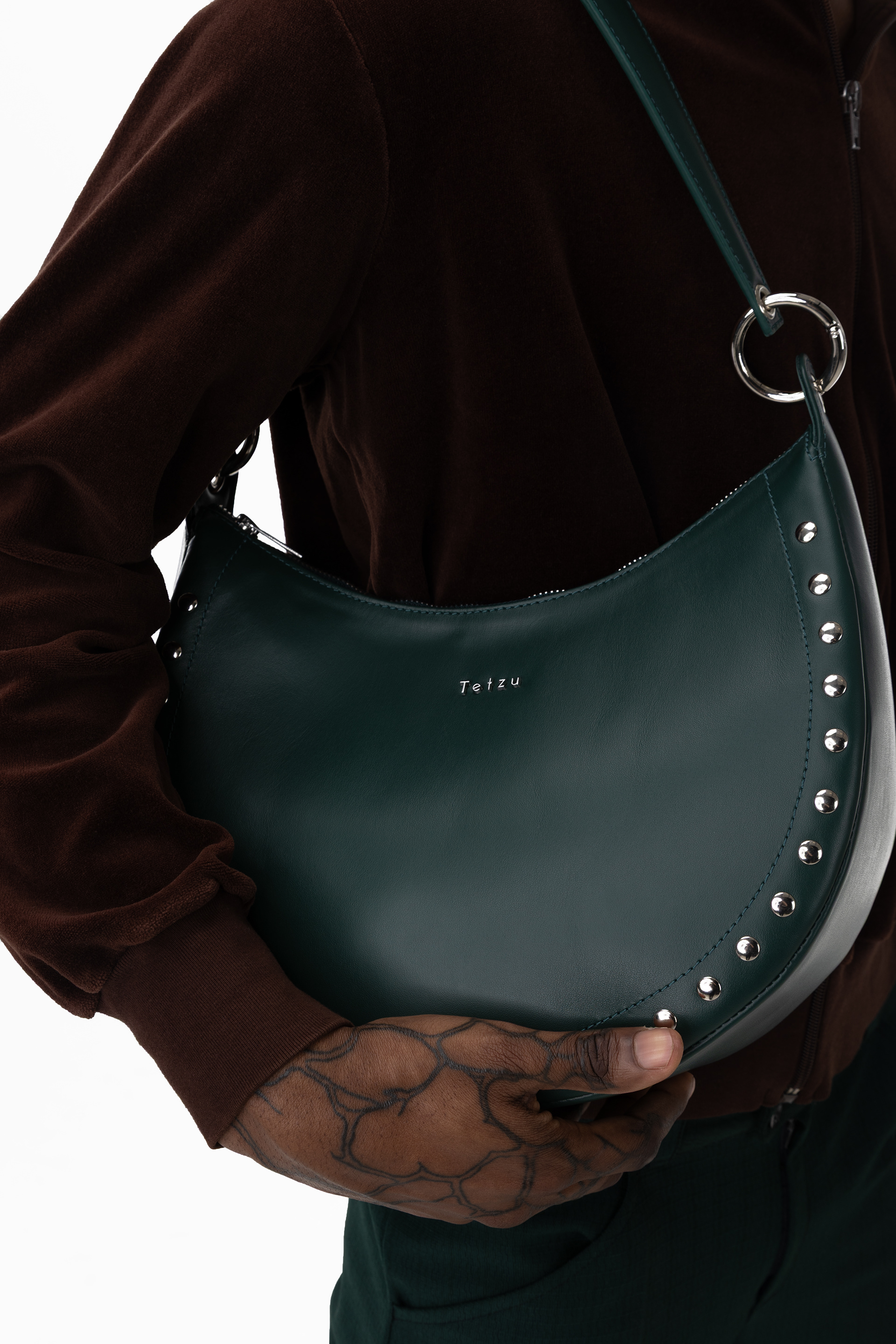
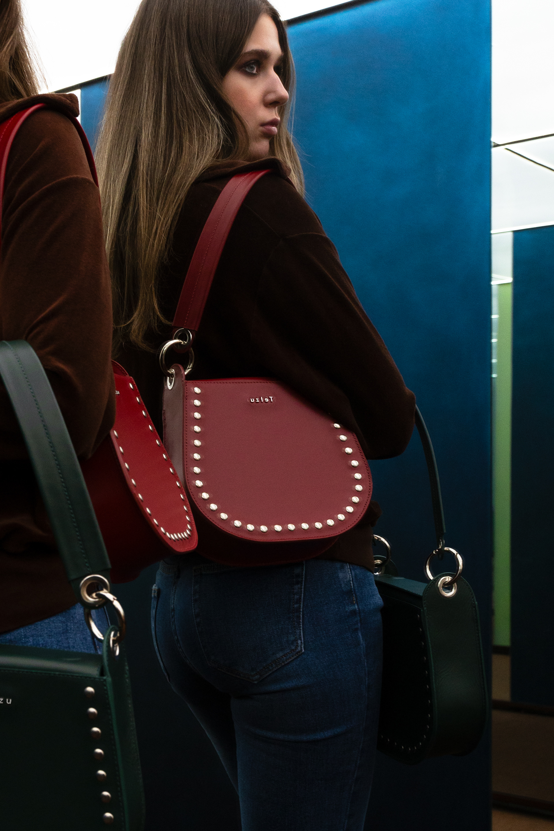
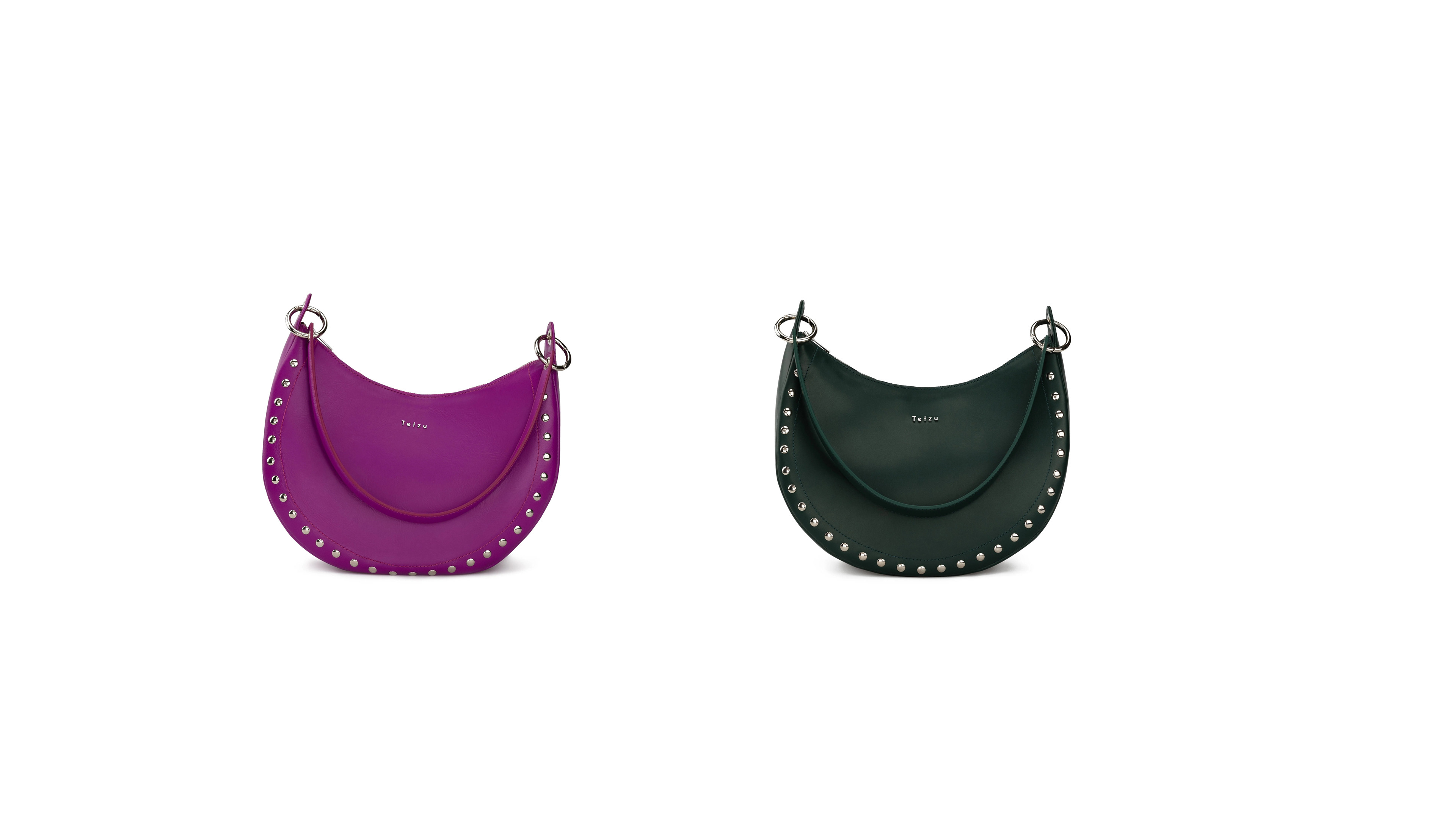
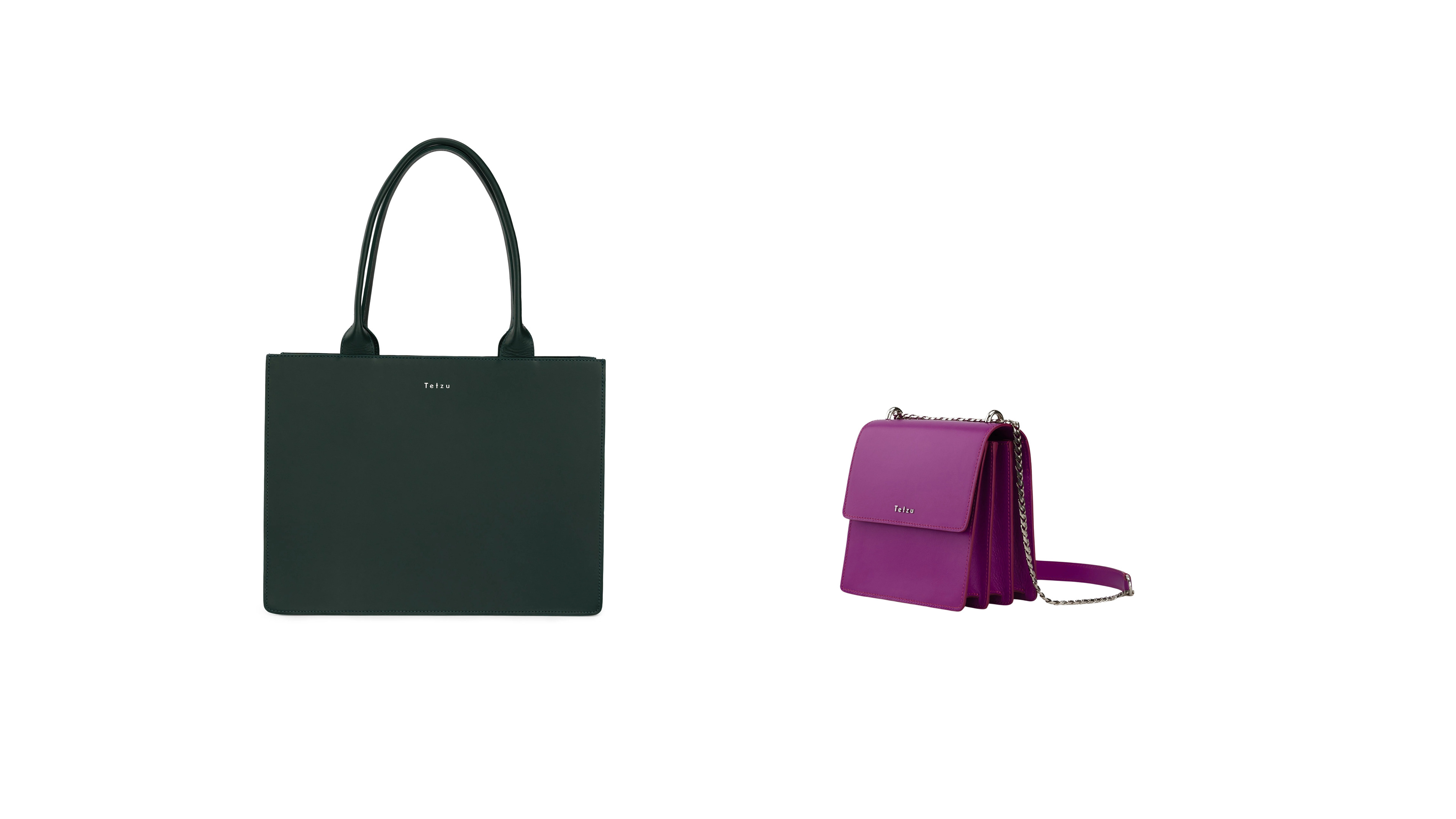
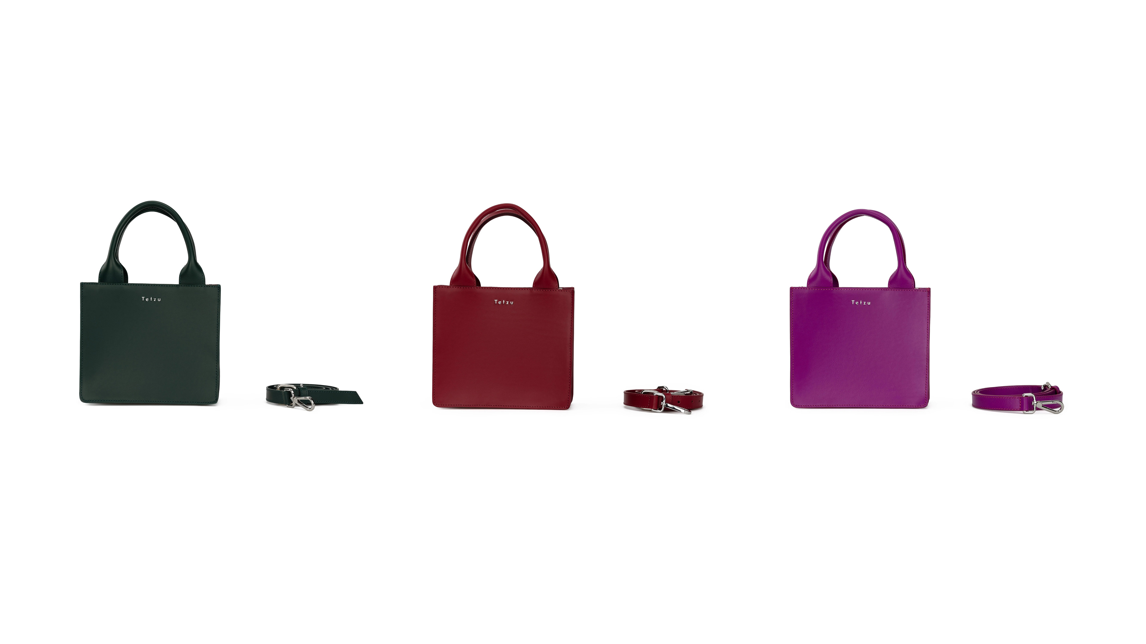
For the collection, I wanted each bag to have a beautiful yet simple silhouette, balancing rounded, angular and accordion-like forms with a sense of edge and a subtle rock ’n’ roll attitude. Rather than relying on overly complex shapes, I focused on creating distinctive silhouettes that feel considered and effortless, allowing the character of each piece to come through in the details, finishes and colour. Versatility was also important, with the bags designed to be transformed and styled in different ways through interchangeable straps.
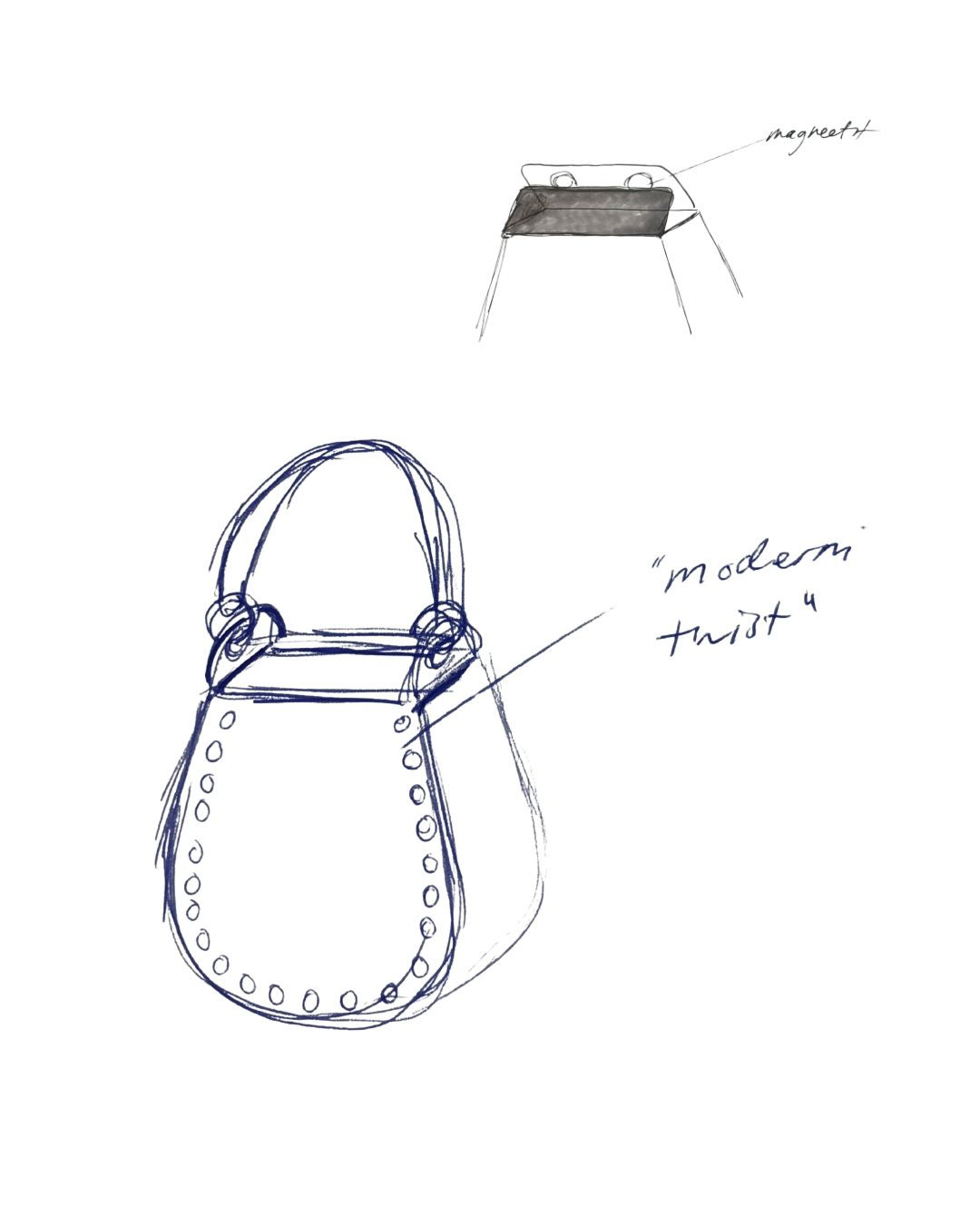
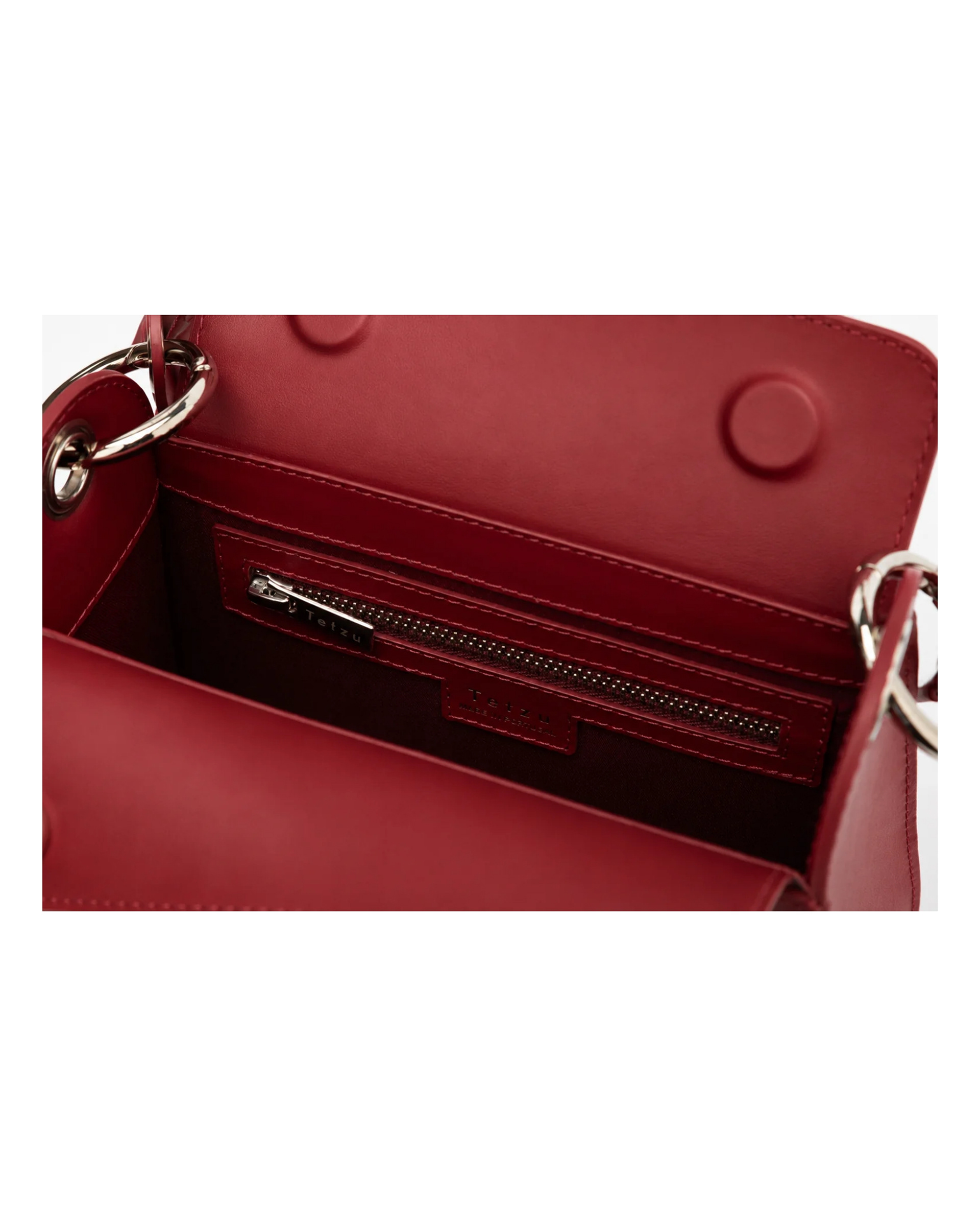
Legacy Leather Collection — Final Products
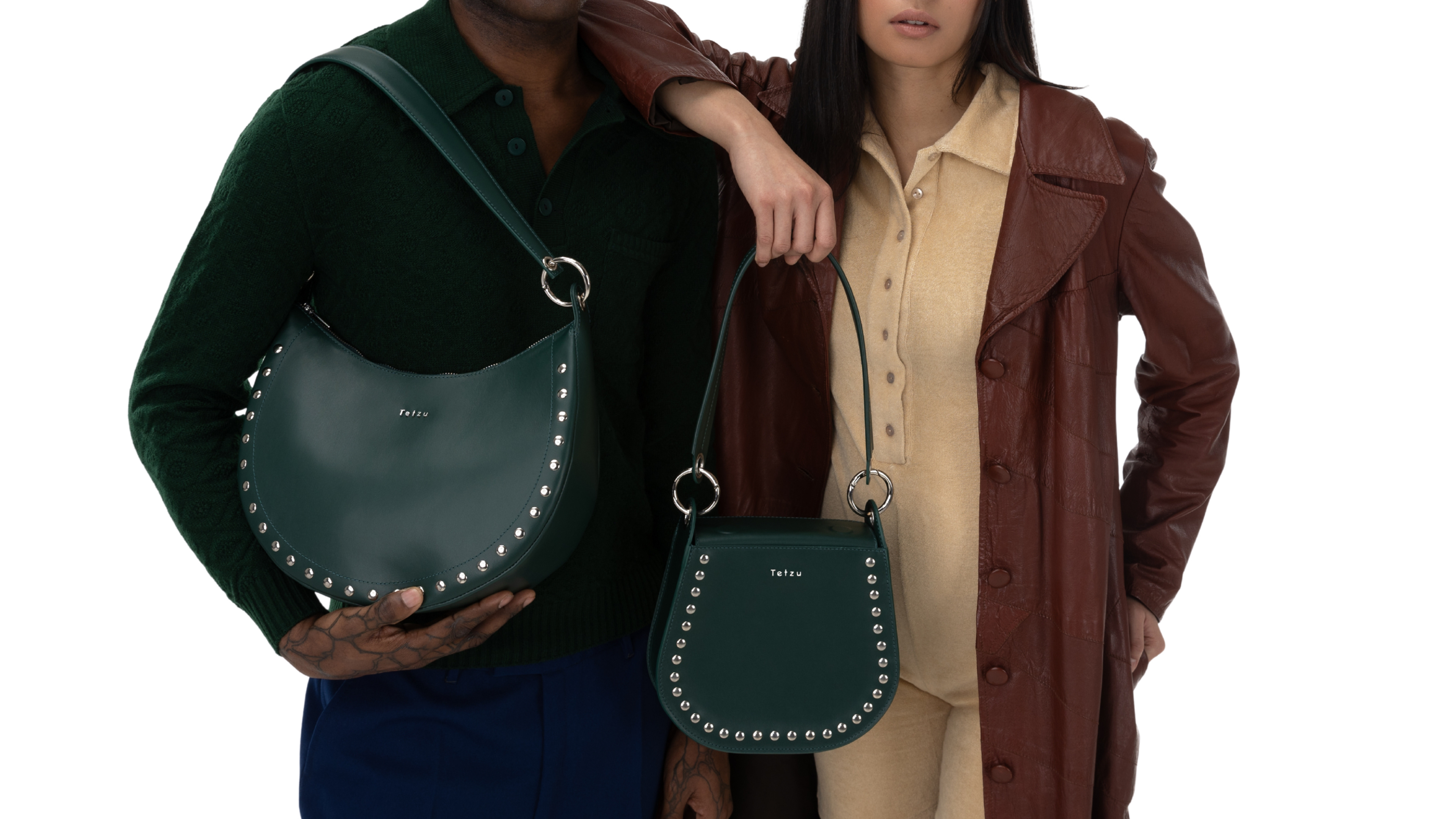
Photographer: Lumi Heikkilä
Colour & Material
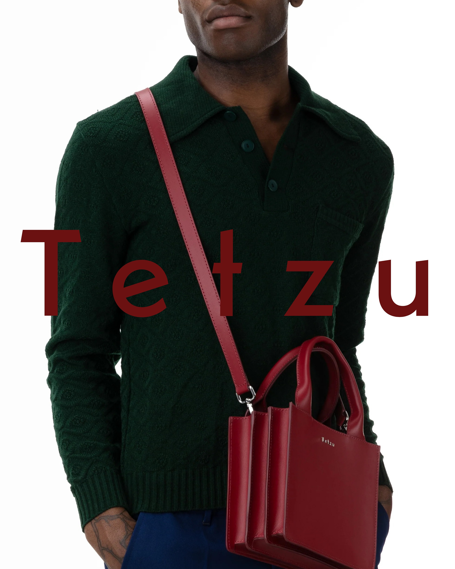
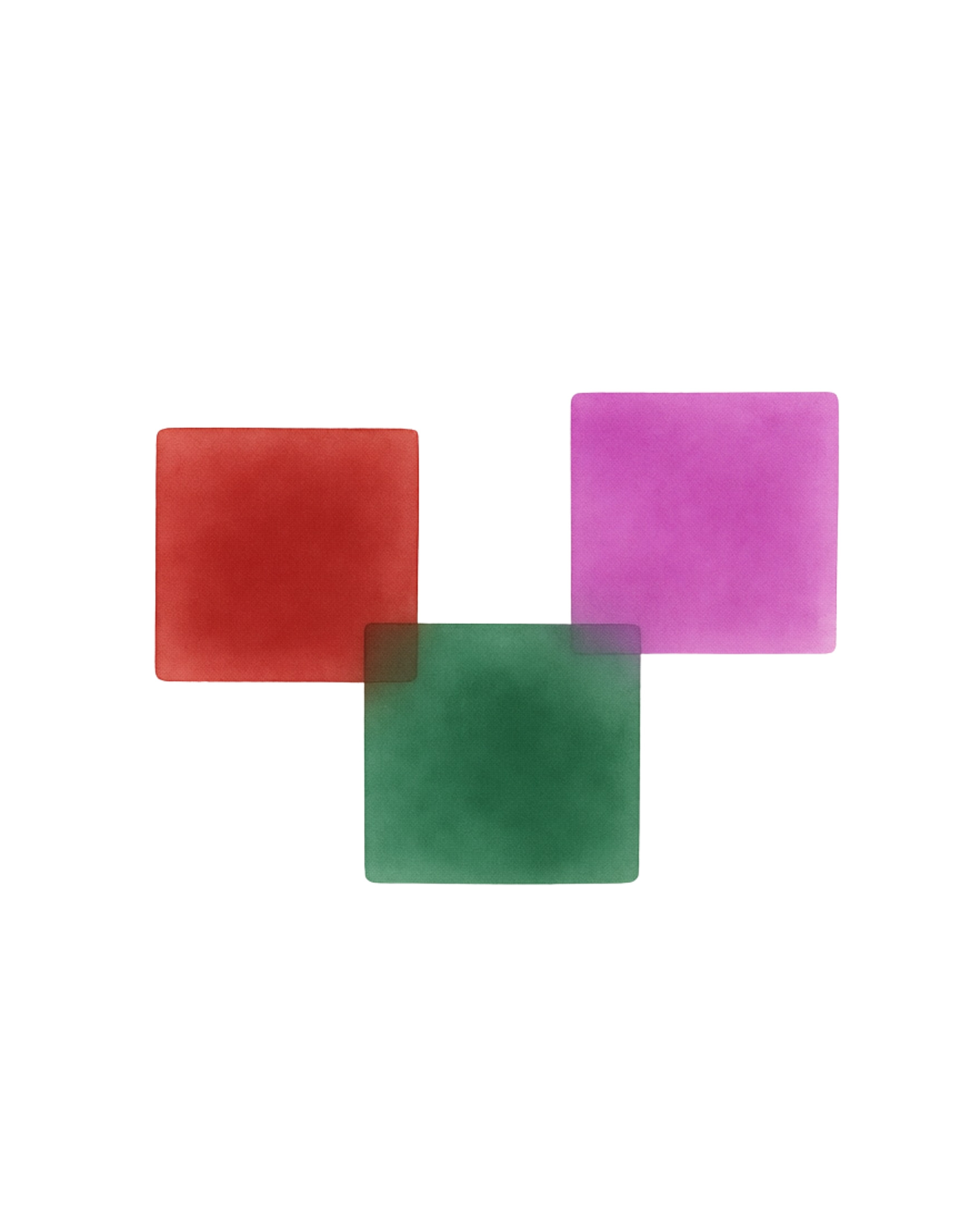
The leather collection combines rich, muted greens and reds with vibrant pink accents. The palette brings together a sense of nostalgia and refinement with the playful energy at the heart of Tetzu.
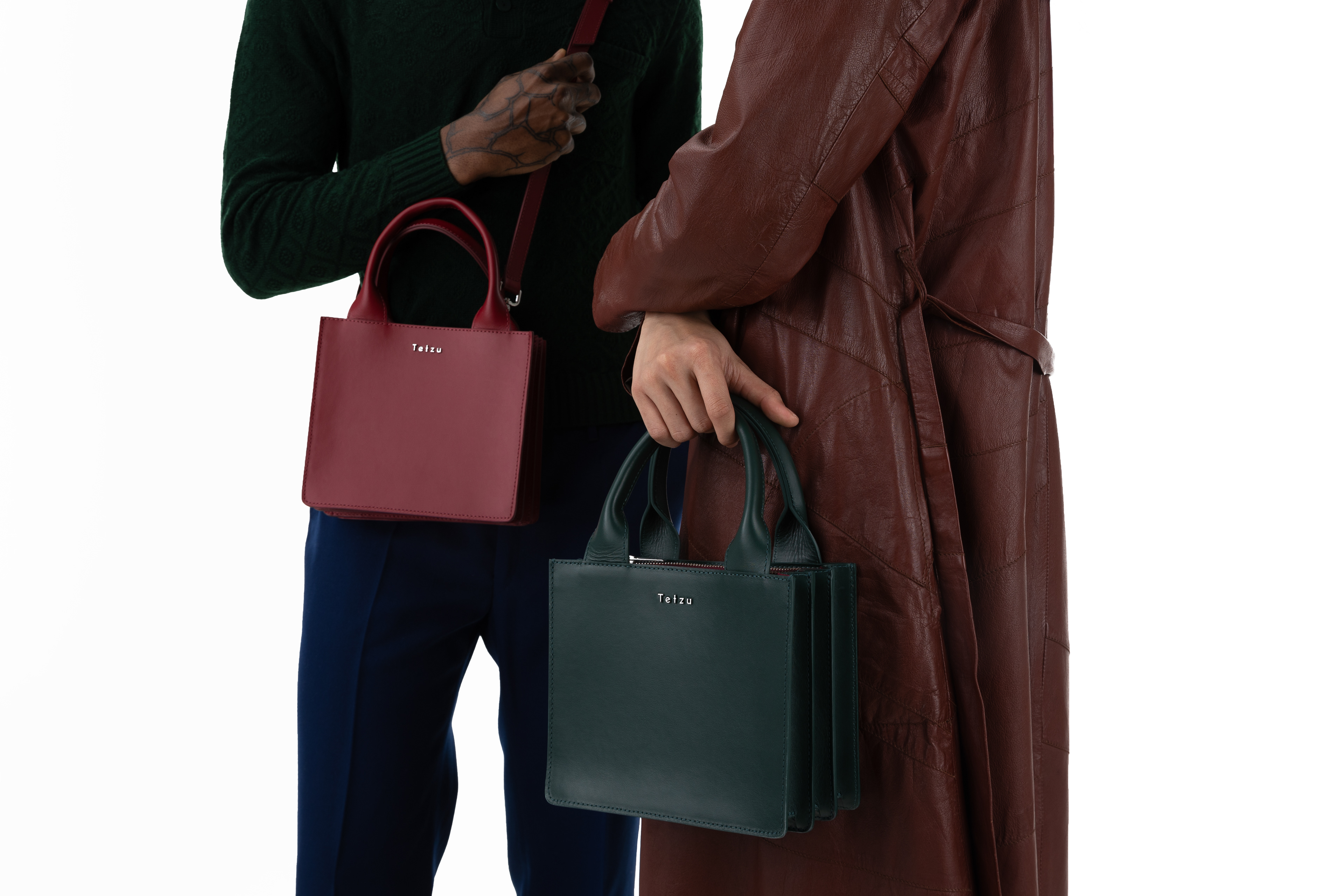
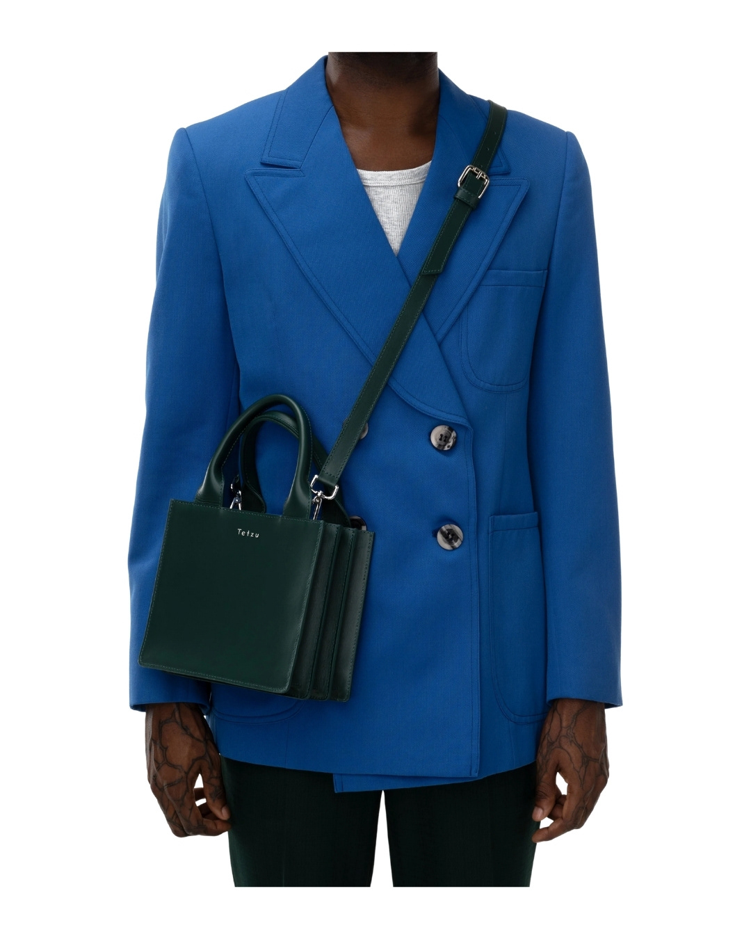
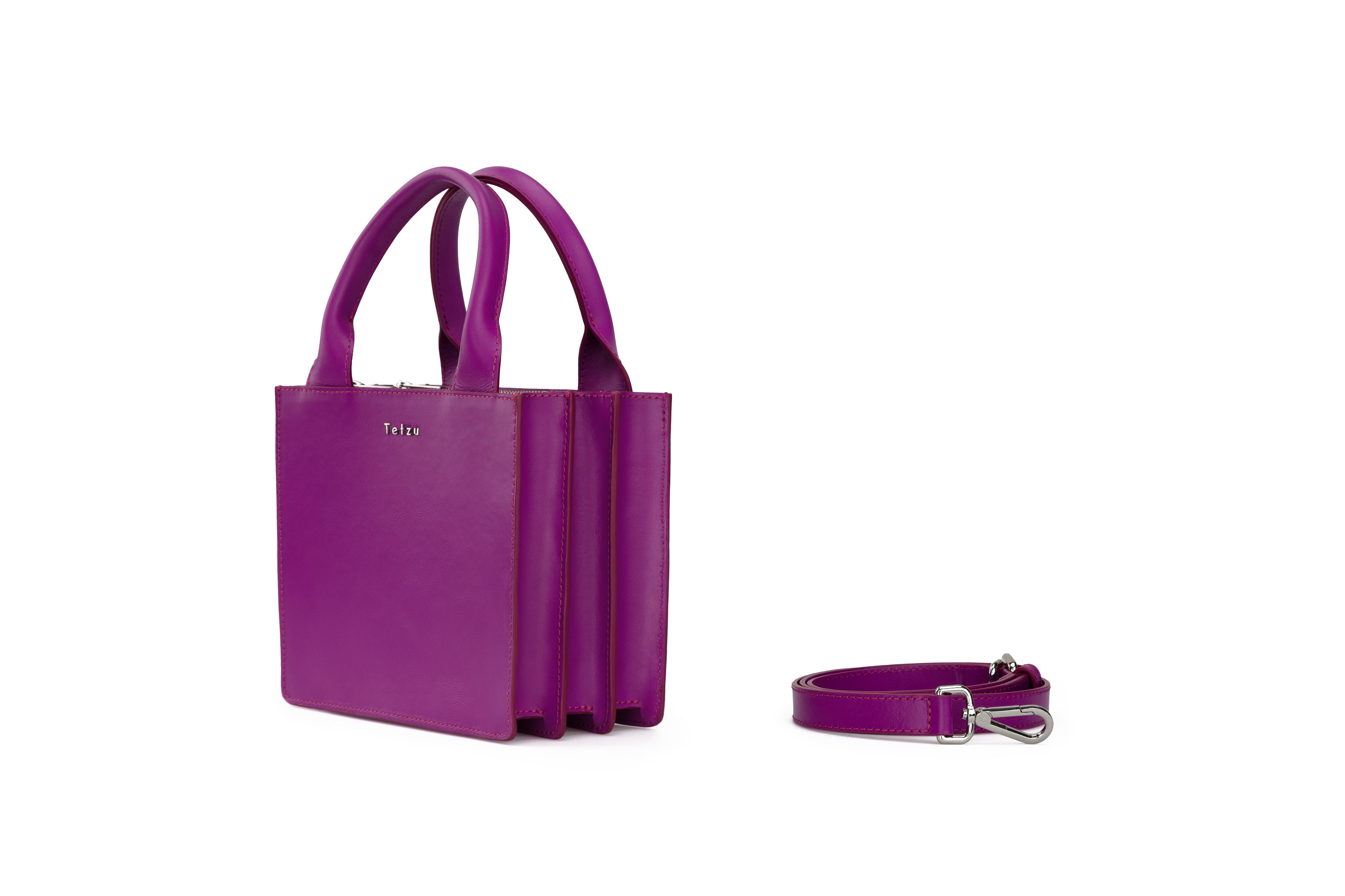
Photographer: Lumi Heikkilä
Production
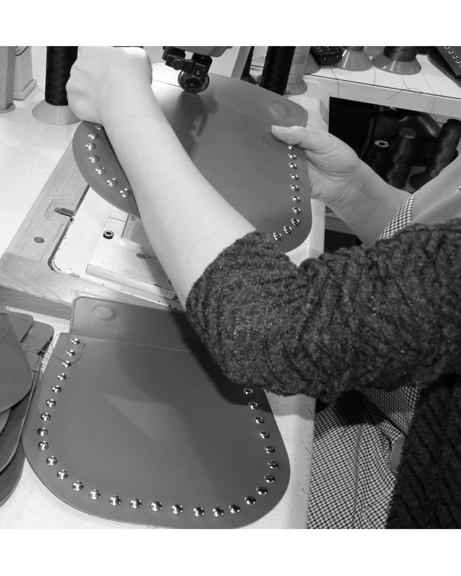
I managed the production process from sourcing and manufacturer collaboration to prototypes and final production, working closely with European manufacturing partners throughout the development of the collection.
Creative Direction
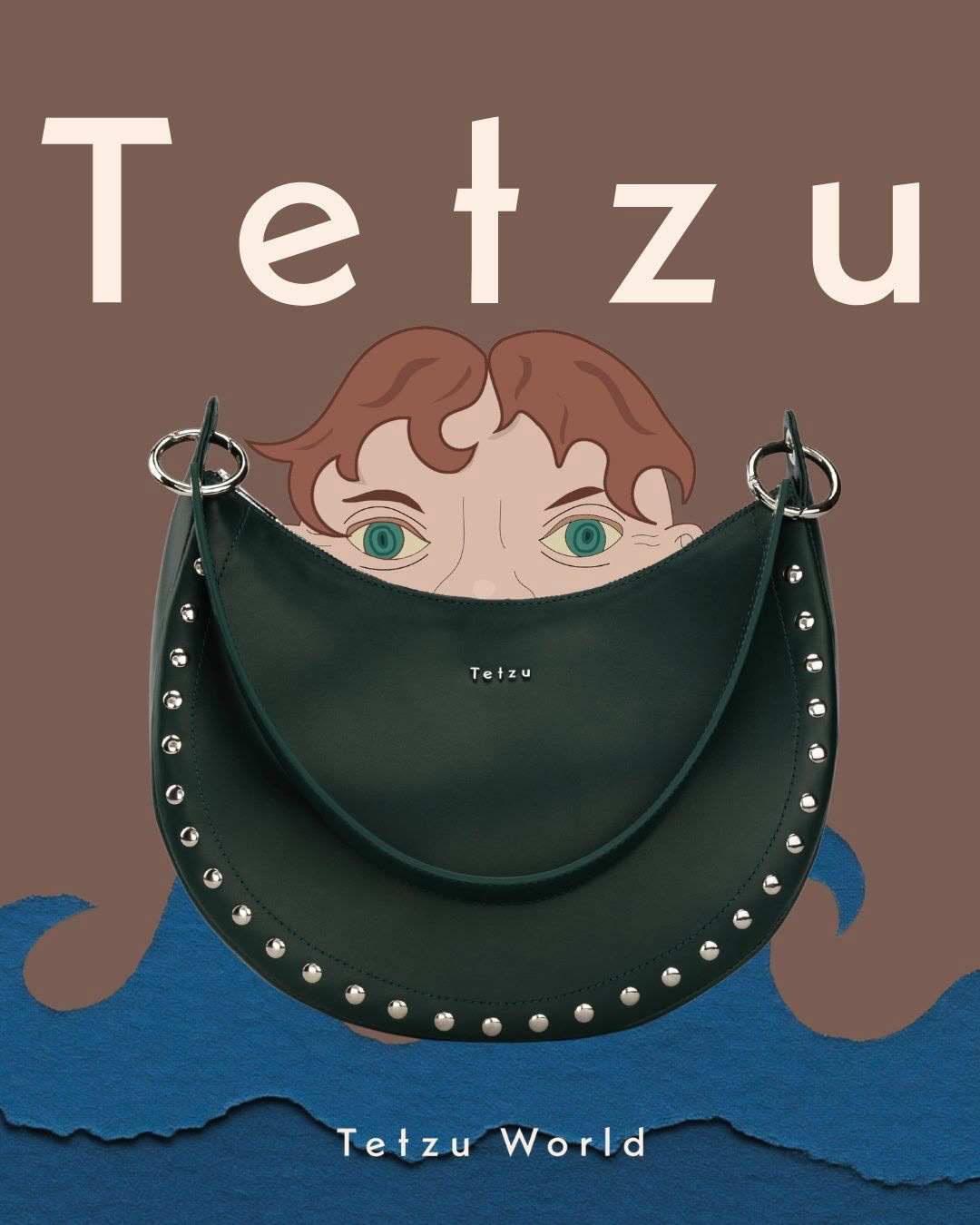
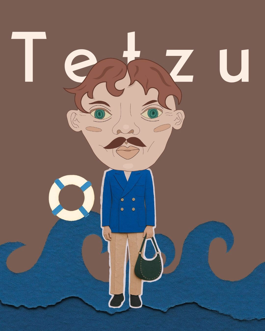
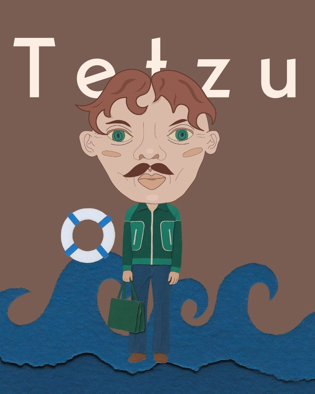
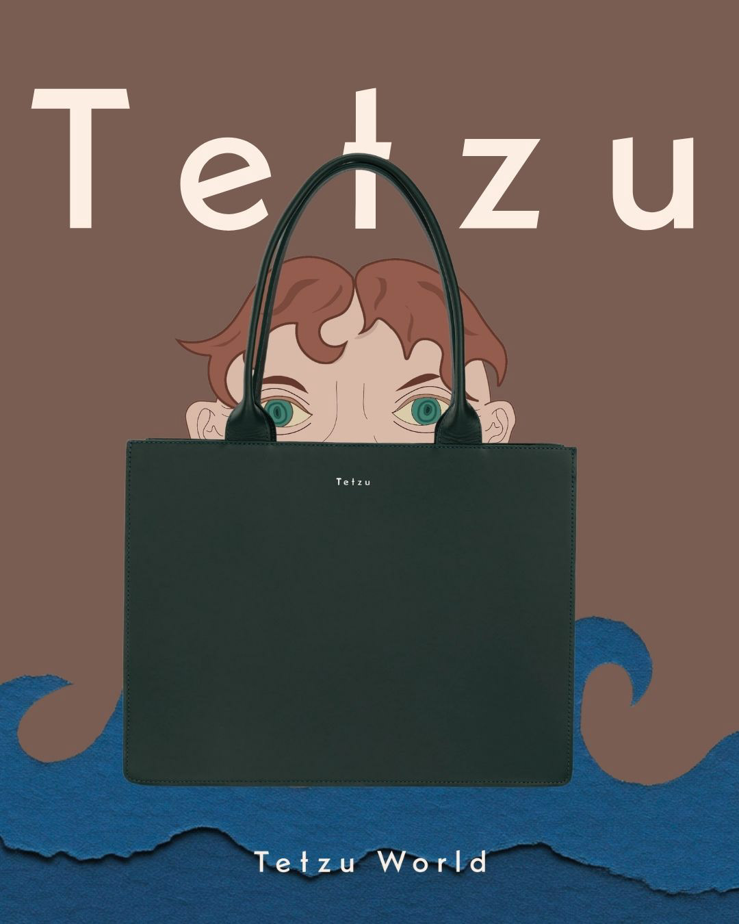
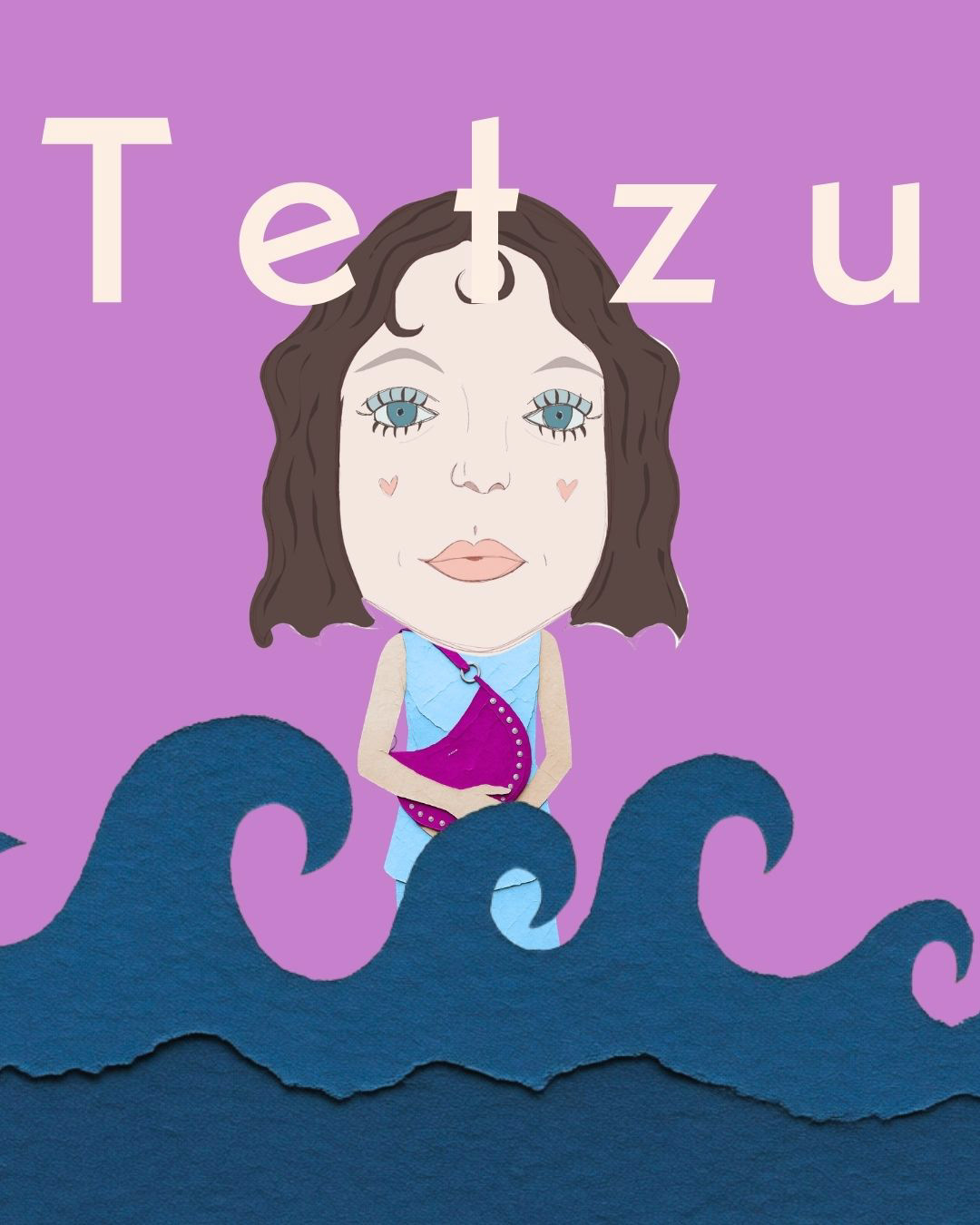
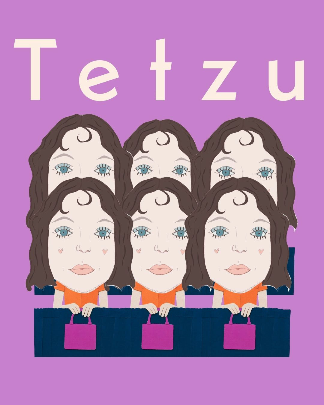
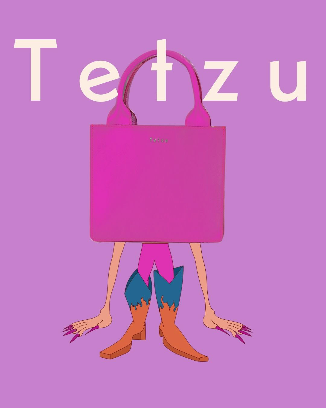
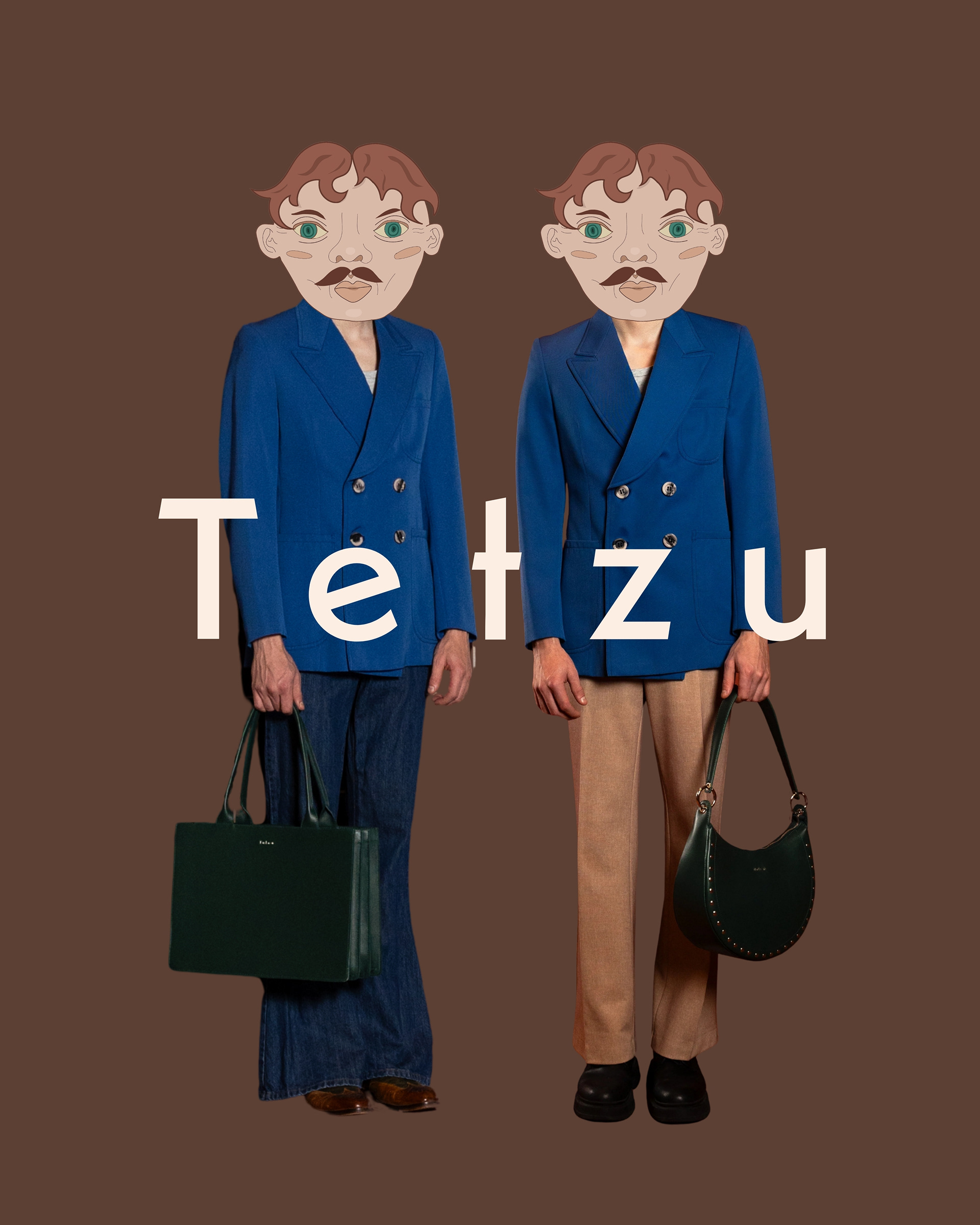
I developed the visual direction around the collection by creating distinct worlds for the products to exist in. Rather than defining a single way of seeing or wearing the pieces, I wanted the imagery to leave room for different interpretations of the Tetzu universe.
One visual direction focuses on a more refined and commercial approach, using neutral tones and understated styling to let the products speak for themselves. Alongside this, I created a more expressive and art-driven world, combining vivid colour and unexpected visual elements to explore the more playful and rebellious side of the brand.
Together, these contrasting directions reflect the freedom at the heart of Tetzu — a brand that can be both considered and commercial, expressive and artistic, without limiting how its products can be experienced.